UI Customize
CSS Skinning
How to change accent the color
You can easily change the color by overriding the --op-accent-color class in your web page:
<!doctype html>
<html lang="en">
<head>
    <meta charset="UTF-8" />
    <title>OvenPlayer</title>
    <style>

        /* Change the accent color */
        #player_id {
            --op-accent-color: red;
        }

    </style>
</head>
<body>

<div id="player_id"></div>

<script src="https://cdn.jsdelivr.net/npm/ovenplayer/dist/ovenplayer.js"></script>
<script>

    // Initialize OvenPlayer
    const player = OvenPlayer.create('player_id', {
        sources: [
            ...
        ]
    });
</script>
</body>
</html>
How to style captions
Captions are drawn as DOM elements rather than by the browser's native caption renderer, so all of their styling can be overridden from your page — no player option is needed.
One rule applies to every example below: OvenPlayer injects its own stylesheet at runtime, so it usually comes after the styles in your page. Give your override a higher specificity by prefixing it with the player id. OvenPlayer moves the id you pass to create() onto its own root element, so #player_id selects the player root and beats the player's own class-only selectors.
Caption safe area
.op-caption-text-container is inset on all four sides and acts as the caption safe area. Cue boxes fill it exactly, so a caption can never sit flush against a player edge whatever line, position and size the cue asks for. Percentages in cue settings resolve against this area, not against the whole player.
| Property | Default |
|---|---|
top, right, bottom, left | 2% |
/* Hold captions clear of the control bar at the bottom */
#player_id .op-caption-text-container {
    top: 2%;
    right: 2%;
    bottom: 10%;
    left: 2%;
}
top and bottom percentages resolve against the player height, left and right against its width, so the same percentage is a smaller gap vertically. Use px or em if you want an identical gap on all four sides.
Caption font size
.op-caption-text carries the text style. Its size is expressed in em against the player root, whose font size OvenPlayer switches according to the player width. There is therefore a base rule plus one override per size class:
| Selector | Player root | Caption font-size | Rendered |
|---|---|---|---|
.op-caption-text | – | 1.5em | base rule |
.large .op-caption-text | 14px | 2em | 28px |
.medium .op-caption-text | 12px | 1.75em | 21px |
.small .op-caption-text | 10px | 1.6em | 16px |
.xsmall .op-caption-text | 10px | 1.3em | 13px |
A single id-prefixed rule outranks all of them, so you only need one. Keep the unit in em to stay responsive, since the player root font size still changes with the player width:
/* Larger than the default, still scaling with the player */
#player_id .op-caption-text {
    font-size: 2.5em;
}
Use an absolute unit instead if you want one fixed size at every player width:
#player_id .op-caption-text {
    font-size: 24px;
    line-height: 1.4;
}
Caption text box
The same element draws the box behind the text. It is an inline box with box-decoration-break: clone, so the background is drawn per rendered line and ends where that line's text ends — a short last line does not get padded out to the width of the one above it.
| Property | Default |
|---|---|
color | #fff |
background | rgba(8, 8, 8, 0.75) |
padding | .1em .6em |
border-radius | .25em |
line-height | 1.5em |
Keep the vertical padding below line-height minus the font's content area, or the per-line backgrounds overlap and the overlap shows as a darker band through a translucent background. Raise line-height along with the padding if you want a thicker box. border-radius likewise applies to every line, so reduce it if stacked lines should read as one block.
/* Plain white text with a shadow instead of a filled box */
#player_id .op-caption-text {
    background: none;
    padding: 0;
    text-shadow: 0 2px 4px rgba(0, 0, 0, 0.9);
}
WebVTT cue classes
Cue text markup is parsed, so <b>, <i>, <u>, <ruby>, <rt>, <v Speaker>, <lang xx> and <c.class> all take effect. The standard WebVTT colour classes are styled for you:
white, lime, cyan, red, yellow, magenta, blue, black, and bg_white … bg_black for backgrounds.
Any other class name is passed through to the DOM, so you can define your own:
00:00:01.000 --> 00:00:03.000
<c.yellow>Yellow</c>, and <c.speaker>a class of your own</c>
#player_id .op-caption-text .speaker {
    color: #50e3c2;
    font-weight: 700;
}
How to change the style
ovenplayer
...
├── src/
│    ├── assets/
│    │    ├── fonts/
│    │    └── images/
│    ...
│    └── stylesheet/
│        └── ovenplayer.less
...
assets/ contains the image file used as the button in OvenPlayer. And you can modify the style yourself in stylesheet/ovenplayer.less.
If you want to know how to build and run, go to the Builds tab.
Add and Edit a new UI
ovenplayer
...
├── src/
│    ├── js/
│    │    ├── api/
│    │    ├── utils/
│    │    └── view/
│    │         ├── components/
│    │         ├── engine/
│    │         │    ├── OvenTemplate.js
│    │         │    └── Templates.js
│    │         ├── example/
│    │         ├── global/
│    │         ├── view.js
│    │         └── viewTemplate.js
...
The view of OvenPlayer has consisted of a template that extended OvenTemplate.
The template has a minimal life cycle starting with onRendered() and ending with onDestroyed(), and you can set an event callback with a valid scope in the template.
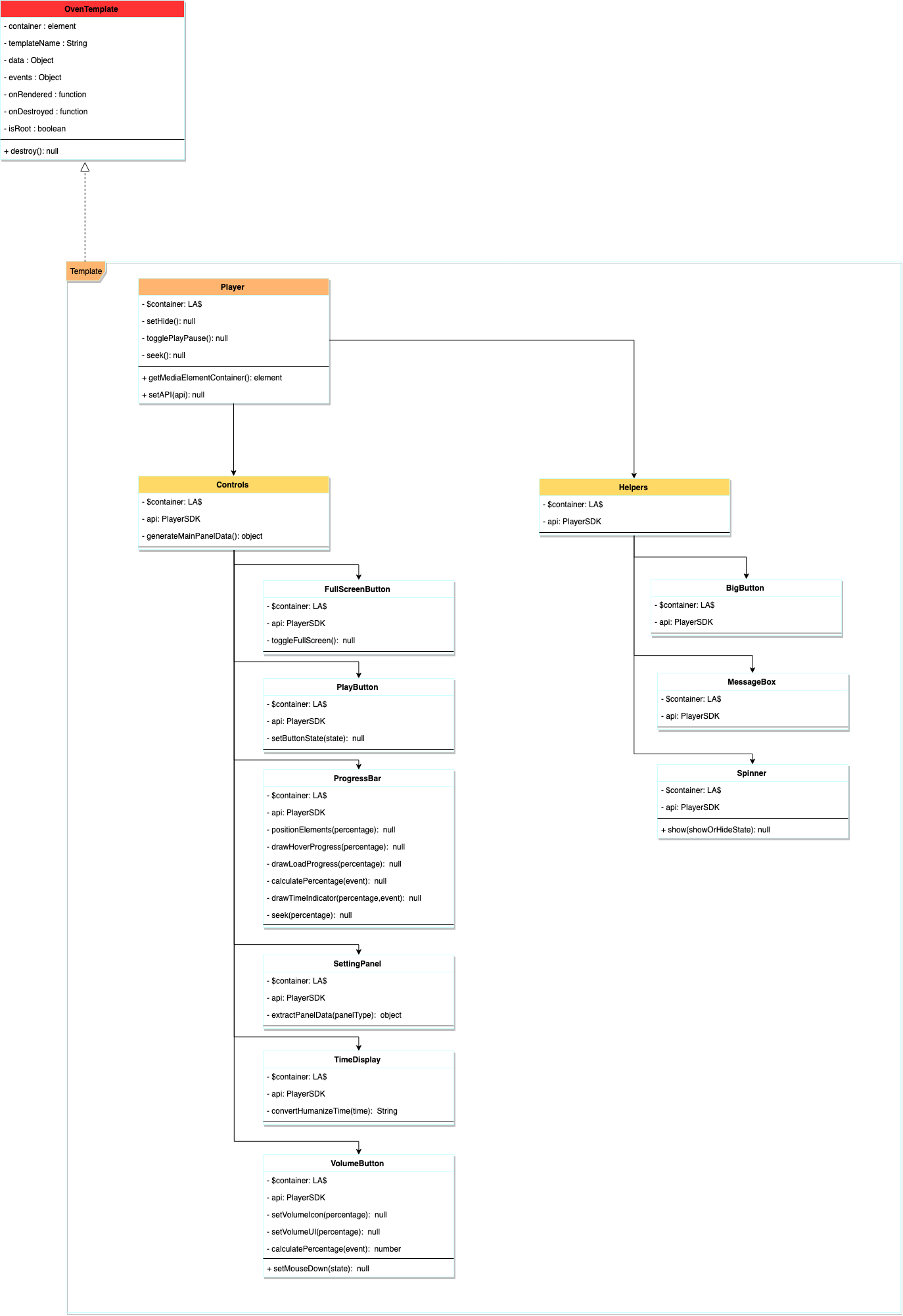
The top-level parent template is view/view.js. View creates child Controls and Helpers templates. Also, Controls and Helpers create and control child templates, respectively.
Through our example TextView (view/example/textview.js), we will explain in the following part how child templates are created, controlled, and passed data by the parent template.
Register a template
The OvenPlayer template has a pair of controller and view, each named {templateName}.js and {templateName}Template.js.
ovenplayer
...
├── src/
│    ├── js/
│    │    ├── api/
│    │    ├── utils/
│    │    └── view/
│    │         ├── components/
│    │         ├── engine/
│    │         ├── example/
│    │         │    ├── textview.js
│    │         │    └── textviewTemplate.js
...
You need to register view separately in Templates.
We have configured textviewTemplate.js corresponding to the view in the TextView. So you register textviewTemplate.js in view/engine/Templates.js.
import TextViewTemplate from 'view/example/textviewTemplate';
import ViewTemplate from 'view/viewTemplate';
import HelpersTemplate from 'view/components/helpers/mainTemplate';
...

const Templates = {
    TextViewTemplate,
    ViewTemplate,
    HelpersTemplate,
    BigButtonTemplate,
    ...
};

export default Templates;
Use a template
In this part, we will show you how to create the TextView in helpers/main.js, the top-level parent of Helpers.
You import textview.js which is controller in the TextView.
import OvenTemplate from "view/engine/OvenTemplate";
import BigButton from "view/components/helpers/bigButton";
import MessageBox from "view/components/helpers/messageBox";
import CaptionViewer from "view/components/helpers/captionViewer";
import Spinner from "view/components/helpers/spinner";
//It adds a textview template for testing.
import TextView from 'view/example/textview';
...

const Helpers = function($container){
let bigButton = "", messageBox = "",  captionViewer = "", spinner = "", textView;
 ...

 const onRendered = function($current, template){
  //It creates the TextView right after Helper is loaded on the screen.
  textView = TextView($current, api, "Hello world. Nice to meet you.");
  ...

 });

 //Callback that is called when Helpers are removed in OvenPlayer.
 const onDestroyed = function(template){
  textView.destroy(); //When Helpers, which is the parent template, is removed, the textView is also removed.

  api.off(READY, null, template);
  api.off(PLAYER_STATE, null, template);
  ...
 };

 //The event to be used by Helpers. However, Helpers are used as a container for the template, so there are no special events.
 const events = {
 };

 return OvenTemplate($container, "Helpers", null, events, onRendered, onDestroyed );
};

export default Helpers;
The source of the TextView is:
import OvenTemplate from 'view/engine/OvenTemplate';

const TextView = function($container, api, text){

    const onRendered = function($current, template){
    };

    const onDestroyed = function(template){
        //Do nothing.
    };

    const events = {
        "click .btn" : function(event, $current, template){
            event.preventDefault();
            alert("Hi!");
        }
    };

    return OvenTemplate($container, "TextView", text events, onRendered, onDestroyed );

};

export default TextView;
$container means the parent's element, and in onRendered(), onDestroyed(), and events(), $current means the element owned by each item.
const TextViewTemplate = function(text){
    return `<div class="textView" style="padding : 5px; background: red; position : absolute; top: 0;">` +
                `<h3>${text}</h3>` +
                `<button type="button" class="btn">button</button>` +
            `</div>`;
};

export default TextViewTemplate;
LikeA$
$container and $current in OvenPlayerTemplate consist of LikeA$ object.
Create LikeA$ object
import LA$ from 'utils/likeA$';
...

let $player = LA$("#player");
Search element
$player.find(".textView");
Access element
$player.find(".textView").get();
Edit CSS
$player.find(".textView").css("color", "#d9d9d9");
Please check /utils/likeA$.js for more information. This is slightly more inconvenient than jquery but enough to control OvenPlayer.
Build and Run
You can build OvenPlayer through the Builds chapter.
npm run watch
You can see the added TextView by building OvenPlayer and running dist/development/ index.html.
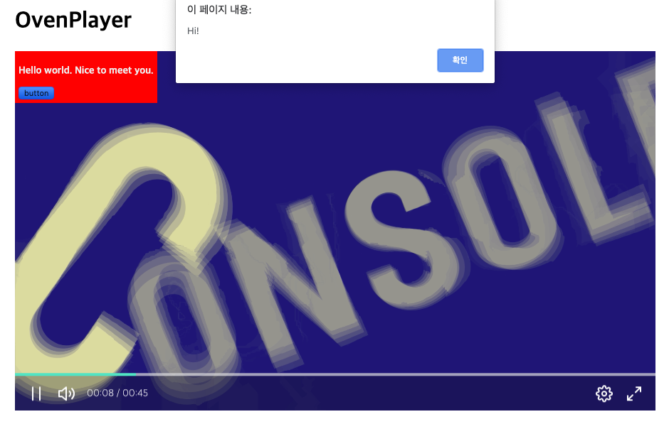
In this way, you can add a new UI or customize the template.