Metrics Dashboard
The Metrics Dashboard is the server-wide view. It is organized top-down the way an operator asks questions: is the service healthy — what is moving — which stream — and is the server itself keeping up.
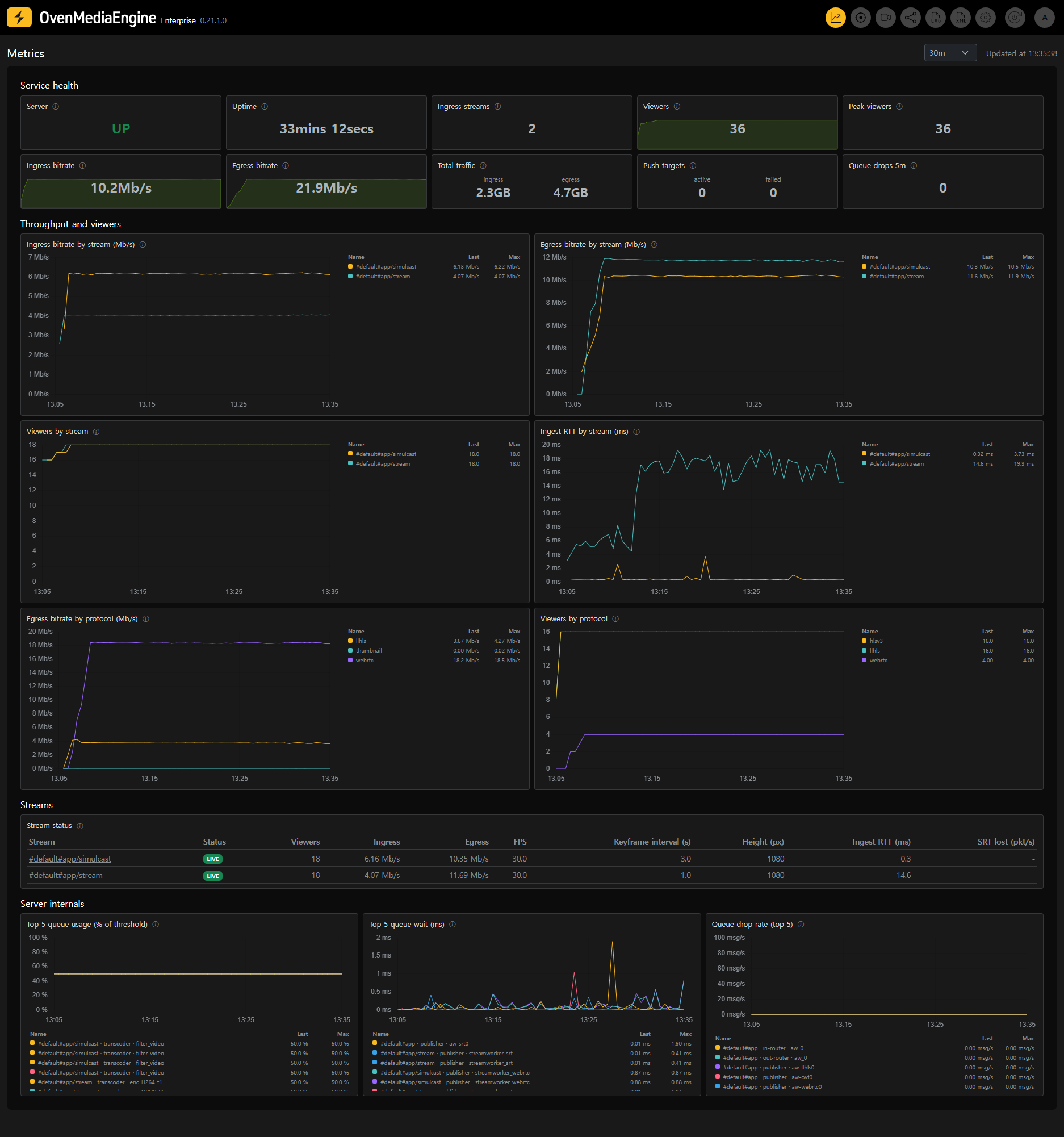
Service health
The tiles summarize the server over the selected range:
- Server — whether the metrics endpoint is being scraped successfully (UP/DOWN). The ⓘ shows the OvenMediaEngine version.
- Uptime — time since the server process started. A sudden reset tells you the server restarted.
- Ingress streams — live input streams right now.
- Viewers — current total viewers, with a background trend line.
- Peak viewers — the highest concurrent viewer count within the selected range.
- Ingress / Egress bitrate — what the server is receiving and sending right now, with trend lines.
- Total traffic — cumulative ingress and egress volume over the selected range.
- Push targets — push (restream) targets currently active, and how many are in an error state.
- Queue drops 5m — messages dropped from internal queues in the last 5 minutes. Non-zero means the server is shedding work; see Server internals.
Failed push targets
When any push target is in an error state, a panel appears below the tiles listing exactly which stream, push ID, and protocol is failing — so a broken restream to an external service is visible without opening each stream.
Throughput and viewers
Trend panels over the selected range, stream-oriented first:
- Ingress bitrate by stream — tells one contributor's problem apart from a server-wide one: a single falling line is that contributor, all lines falling is your side.
- Egress bitrate by stream — which stream is filling the uplink.
- Viewers by stream — audience per stream over time.
- Ingest RTT by stream — round-trip time to each contributor, regardless of protocol. A climbing line means that contributor's network is degrading — often before viewers notice anything.
- Egress bitrate by protocol / Viewers by protocol — read together, they separate "viewers left" from "delivery of one protocol broke": viewers flat while a protocol's bitrate collapses points at delivery.
- Push bitrate by target — appears when push targets exist; shows whether each restream is actually flowing.
Streams
Every stream seen within the selected range, one row each:
| Column | Meaning |
|---|---|
| Status | LIVE, or when the stream ended (dimmed row, last observed values) |
| Viewers | Current viewers |
| Ingress / Egress | Current bitrates |
| FPS | Input frame rate — of the lowest video track, so one collapsing track cannot hide behind a healthy one |
| Keyframe | Keyframe interval in seconds |
| Height | Vertical resolution of the input |
| Ingest RTT | Round-trip time to the contributor |
| SRT lost | Packet loss rate, for SRT ingests |
Values that cross warning thresholds are colored. Click a row to open the stream's Stream Quality page over the same time range.
Server internals
The server processes media through internal queues; these panels show whether it is keeping up:
- Top 5 queue usage (% of threshold) — queue depth normalized to its drop threshold, so every queue shares the same scale: 100% is where drops begin. A queue climbing toward 100% is the earliest warning that the server cannot keep up — usually the transcoder on an overloaded CPU.
- Top 5 queue wait (ms) — how long items sit in the busiest queues. Rising wait adds end-to-end latency before anything is dropped.
- Queue drop rate (top 5) — messages actually being discarded per second. Anything above zero here is a service-affecting incident: frames or packets are being thrown away.
Queue names are shown as #vhost#app/stream · component · worker, so the affected stream is identifiable at a glance.